


This intensive UX project was conducted as part of The UX Design Institute Diploma course. I designed an intuitive airline booking experience that focused on usability and accessibility.
UI Design
Research
Jan 23 - June 23
The Problem
Users often face issues with airline booking platforms. The problems include distracting ads, confusion during the seat selection process, software that doesn't remember user information, a time-consuming booking process, and unclear navigation.
The Solution
Research insights led to a clutter-free, streamlined booking experience with improved seat selection, user-friendly navigation, and
user preference recognition.
My Role
As the sole UX Designer working on this project, I conducted research, analysed data using an affinity diagram and customer journey map, and designed a website addressing user pain points.
Design Process
1. Research
2. Analysis
3. Design

Competitive Analysis
Online Survey
Usability Testing

Affinity Diagram
Customer Journey Map

Flow Diagram
Interaction Design (sketches)
High Fidelity Prototype
Annotations
Research
In this project, thorough research was crucial for understanding users' objectives, behaviours, and context. It played a pivotal role, guiding the design process. A triangulation approach, using multiple data sources, boosted result accuracy and confidence.
Competitive Analysis
View Competitive AnalysisI started off the project with researching 4 different airline booking websites to gain insights into how best to design my own airline booking website. The objective of this research technique was to learn how the best-in-class websites solve the problems we are trying to solve, to understand the industry conventions/best practices that we should follow and to learn from the competitors mistakes.


Key Insights:


Online Survey
I conducted an online survey to explore the usage patterns and behaviours of potential customers. The data collected aimed to assist in making more informed design decisions. The primary objective of this survey was to develop an understanding of the mindset of users when using airline booking websites, and to gather insights into their goals, behaviours, and contextual factors, paying special attention to identifying potential pain points throughout the booking process. This research will enable us to enhance the user experience by addressing these pain points and creating a more accessible design solution.


Key Insights:
Usability Testing
View Usability Test NotesAs part of this project, I conducted a usability test (including interviews) on two competitor websites: Ryanair and Emirates. The primary objective was to gain valuable insights into the goals, behaviours, and mental models of users during the flight booking process. Additionally, the test aimed to identify and address key issues and pain points that users may encounter, which would help inform the development of our own website with the goal of creating a pleasant and intuitive user experience.
Furthermore, during this project stage, I thoroughly reviewed and analysed two additional usability tests (conducted by UX Design Institute), carefully taking notes to extract valuable findings.

The user feels like the departure and arrival time placement on the flight selection page could be revised to ensure people don't mix the times up.
The user prefers to use the calendar selection feature, instead of typing dates into date formatting field.
The user had issues with the positioning of the flight times; stating that a mistake could easily be made.
The user was happy that the software remembered her location when it came to inputting the flight details.

Found the flight search menu very straight forward as the airports were clearly visible on the list.
Some of the benefits displayed on the package options are unintuitive for the user leaving some unanswered questions.
The user shows concern over the “Search Flight” CTA not being distinctive enough; suggests different colour.
The user had issues with the positioning of the flight times; stating that a mistake could easily be made.
.png)
Key Insights:
Analysis
At the stage, we have done the research to understand the problems/pain points at hand. The next stage is to analyse the data so we can express the problem clearly. We need to thoroughly understand what the problem is before we start to design the solution.
"A perfect formulation of a problem is already half its solution" - David Hilbert
Affinity Diagram
View Affinity DiagramAfter collecting research data, I distilled key insights and organized them into groups. These insights, grouped logically, ranged from user-related aspects to payment issues. This process improved data clarity and guided the design process.
.jpg)
.jpg)
.jpg)
Key Insights:
Customer Journey Map
View Customer Journey MapAfter creating the affinity diagram, the next step was to define the high level steps in the user's journey. This was done by creating a customer journey map. For each step, I documented the goals, behaviours, context and mental modals of the user, and determined if there were any positive interactions or pain points that the user discovered during their booking experience. Additionally, I used direct quotes from customers to add a personal touch and bring the journey map to life.

.png)
The price is the most visible on the search and select page
A table with a distinctive colour coding system to differentiate between the different seats and prices
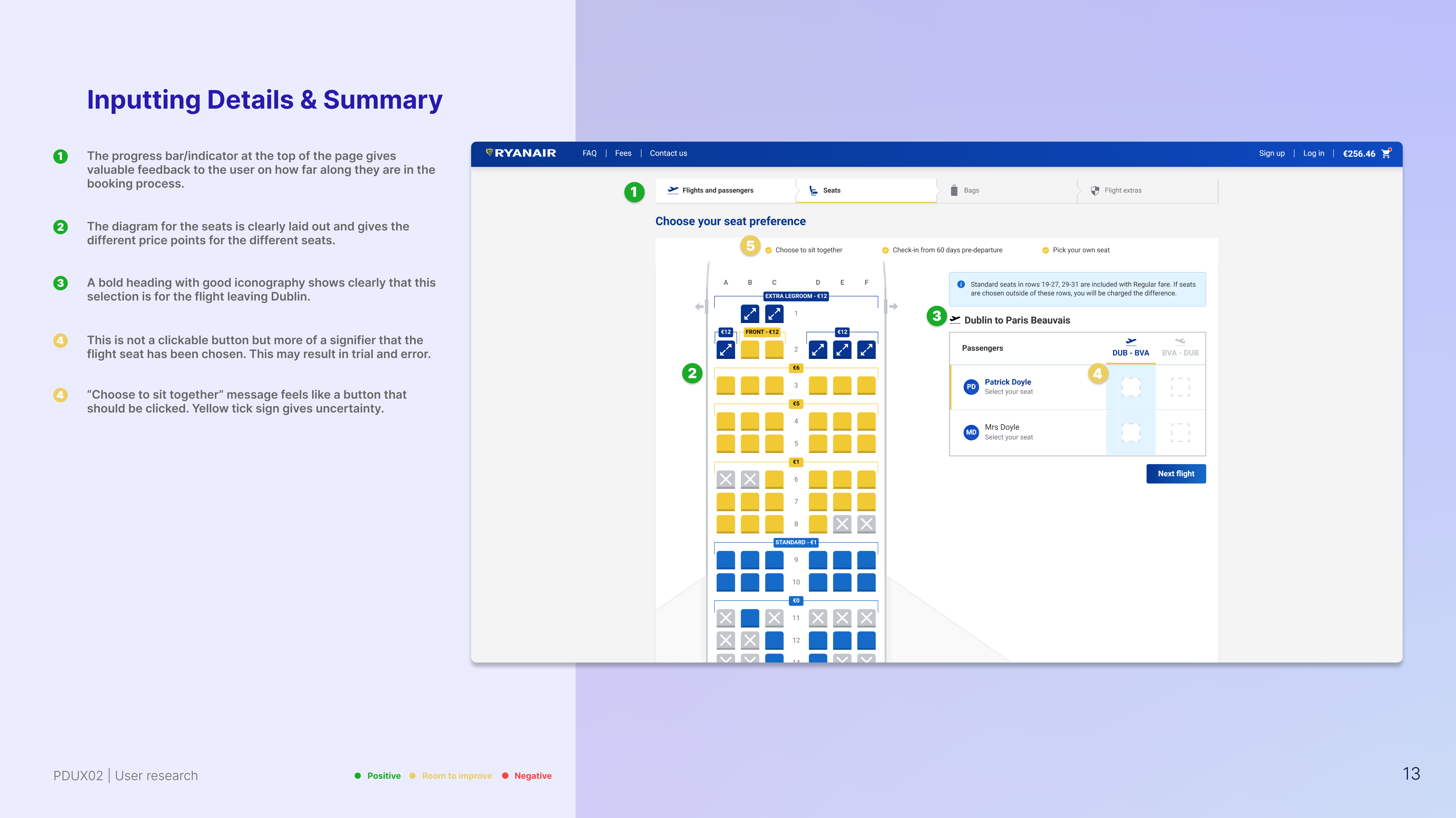
“Choose to sit together” message feels like a button that should be clicked. The yellow tick sign causes uncertainty
Automatically inputs all user details if saved before on desktop; reducing time in the process
Summary of the flights is given with information on times etc.
The user needs to scroll a full page to get to this payment section passing adverts for extras
Having to click twice to confirm seat is annoying
“I do that because I can actually make sure it’s the right day” - (Calendar feature)
User confuses the departure time with the arrival time
Key Insights:
Design
After analysing research data with the help of the affinity diagram and customer journey map, we've extracted valuable insights to shape our design solutions.
These solutions are thoughtfully prioritised based on the severity and frequency of issues, ensuring they not only meet user needs but also enhance the overall experience.
Design Goals Prioritised
Flow Diagram
View Flow DiagramThe first step I completed in the design process for the airline booking website was creating the flow of the website. My main objective was to address the issues identified during the research phase, which were highlighted in the affinity diagram and customer journey map.
In this project, I defined a high-level flow specifically for the desktop website, focusing on one primary use case. By undertaking this task, I aimed to streamline the user experience and ensure a smoother journey for users during the booking process; with focus on the above goals.
.jpg)
Interaction Design (Sketches)
View SketchesIn this project phase, I expanded on the previous flow diagram and created screens to guide users through the website. My main focus was addressing user issues and goals while considering three key design priorities. I aimed to improve the user experience while also optimising for business goals like conversion rates. This phase helped identify and fix issues early, benefiting both users and the business.
The home screen to be simple; containing only essential elements. Easily accessible top navigation displaying secondary use cases
Software interested in user; default GPS location. Makes it feel more personal
CTA button in contrasting colour and size; digital affordance to make action obvious
Offers are not glamorised; only a few options given. Clear information hierarchy
.jpg)
Large diagram for choosing seat displayed with clear contrasting icons to show different seats and prices
Option to choose seats later is available
Clear feedback is given
Once user clicks confirm seats; diagram will shift to the return flight and process repeats

Only fields that are actually required are shown
Visual of card to match system and real world; perceivable and clear
Field length acts as an affordance to show amount required
Summary given to side of payment screen; displaying all flight info and prices
.jpg)
Design Goals Met
To address the previously identified issue of seat selection being unclear and frustrating, we designed a more user-friendly interface. This design included enlarging the seat selection diagram and implementing improved feedback and controls for users when making their seat choices.
In response to user frustration caused by excessive ads, we optimised ad placement by reducing their frequency. This adjustment aimed to strike a balance between enhancing user experience and meeting our business goals for a feasible, viable, and desirable product.
To address user concerns regarding the software's lack of interest, we implemented personalisation features. One notable improvement was the utilisation of smart defaults, such as GPS location detection, to enhance the software's personalisation and user engagement.
High Fidelity Prototype
View PrototypeThe next stage of the project involves creating a high-fidelity prototype to test the high-level flow, screen layouts, and interactions. This prototype serves as a more refined and detailed representation of the website's user interface and functionality. It closely resembles the final product, allowing stakeholders and users to interact with a realistic version of the website.


Annotations (Wireframes for Devs)
View AnnotationsAfter carefully designing the screens and interactions based on our extensive findings, we have effectively addressed the identified pain points and enhanced the user experience. Now, our attention turns to providing developers with the precise details required to accurately build the website. Defining the rules governing the functionality of each element, establishing error feedback, and specifying input field validation are crucial aspects that I will meticulously outline.


Conclusion
Design Solution
In the course of the project, I implemented numerous modifications to the booking website's flow, particularly focusing on a significant overhaul of the seat selection process, which proved to be a problematic stage for many users. By incorporating industry-standard UX practices and leveraging user feedback, I aimed to design an efficient and user-friendly experience. The result is a website that addresses user pain points and achieves mental modal alignment, ultimately enhancing the overall user experience of the booking application.
Lessons Learned
Throughout this project, I discovered numerous intriguing insights. One of the most notable takeaways is that users can easily become frustrated if the software presents challenges and complexity. This frustration often leads to users abandoning their booking journey, resulting in lower conversion rates. The research and usability tests highlighted significant issues in the early stages of the booking process, emphasizing the crucial role of UX. This project exposed me to a wealth of knowledge that will profoundly shape my philosophy as a UX Designer. Above all, I learned that the research phase holds utmost importance in the design process. It is impossible to create effective solutions without a clear understanding of users' goals, behaviours, context, and mental models. By prioritising research, we can tackle problems more comprehensively and deliver impactful user experiences.
Next Steps
This project is an ongoing process that continues to evolve over time. After evaluating the current state, I have identified two important next steps for further improvement:
Mobile Native Application:
The immediate plan is to design a mobile app specifically for the airline booking website. The aim is to create an app that allows users to easily check in for flights and manage their bookings using their smartphones. This requires conducting additional research focused on designing a user-friendly mobile booking experience.
More Usability Testing:
During the prototype phase, I conducted a test to evaluate usability. Valuable insights were gained, including the need to emphasize pricing when adding seats and extras. To uncover more issues and enhance the overall user experience, I believe it's essential to conduct further usability testing. Overall, I consider the project a success, achieving a remarkable 95% score in the course. However, I believe there is always room for improvement.


